Client Briefs & Other
- airahman

- Jan 19, 2020
- 18 min read
Updated: May 17, 2020
Here I will document all work-related learning that I partake in during this module.
Presentation Ideas
Following from my 601 submission, I wanted to work on my hand-in format, I want to elevate the presentation by working on a box that consists of the perfect dimensions for each of my hand in elements, concealing different compartments for each book, memory stick and any other articles. Rather than using an intricate line drawing as I did in the last module, I will aim to brand it with Gemini Branding's logo to make it more coherent.
I visited the woodwork workshop to enquire about the possibility of creating custom boxes for each element/t-shirt and collectively a larger box to fit them all. However, as I didn't have an induction, I signed up for one so then I could go back and work in my own time.
UPDATE
Due to the ongoing circumstances of the global pandemic, the submission has to be strictly digital.
BRIEFS
Bouvier
Continuing work from last module for Greg Moseley, I have been asked to rework the logo, alongside the animation and create artwork for two soon to be released singles.
Working on the logo first, I wanted to experiment with as many variations as I could, as it helps me understand the clients preferences better, as well as helps me find my own creative style and get into a good workflow better. Starting with block colours/gradients; I wanted to base the background colours off Marge 'Bouvier Simpson - using the 3 main colours of her character: blue, her hair; green, her dress; and yellow, her skin.
With Greg not certain about any of them apart from the black one, I experimented further with using patterned and textures backgrounds, sticking to using the colour orange after considering the block colours didn't go down too well.


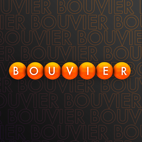
The last image is the one chosen by the client, using a repeater of the original text, creating a stroke/hollow outline in photoshop, I then rasterised the layer in order to add a colour gradient over the entirety of the collated text, as opposed to just singular text which would then be repeated and create a lot of distracting colour. Experimenting with a few colour gradients, Greg found the orange-purple to be his favourite.
The first artwork that he requested for a single release was for a remix of a Luca Blue song - Narrow. The fact it was a remix made me want to work with the original artwork and switch up the colour scheme and add a small yet prominent element that claimed it as Bouvier's. From my own music taste, I thought of ideas from other DJ artwork EPs, and a big trend right now is subtle stickers that portray the artists name or logo so this is the inspiration I went with when designing this brief.


Testing a few different colour schemes, I kept in close contact with Greg Moseley (the client) going back and forth, deciding which one he wanted. Using a relatively simple gradient maps and experimenting with various colours, the one that stood out to me was the purple background with the gold sticker as it has a large amount of contrast and catches your eye. Also, it is very close to being an inversion of the original artwork which works really well as it is easily recognisable.


After deciding on the purple and gold sticker, I tested out different sizes of the sticker to get it just right, as the original was way too large, and then I made it too small. With placing it on the top right corner of the inner-box, it holds the composition together and draws your eyes to it. Below is the original artwork (left) and my recreation for the Bouvier Remix (right).


LNER EP Artwork


A Bar Below poster re-work
Another brief from last module, overlapped into this module as I was asked to create certain changes, reworking the final outcome until the client was happy. This was a relatively straight forward fix; correcting some shadows and text placement and re-exporting them in various formats so they are optimised and can be applied to various social medias; facebook, instagram, twitter, etc.


Below The Surface posters
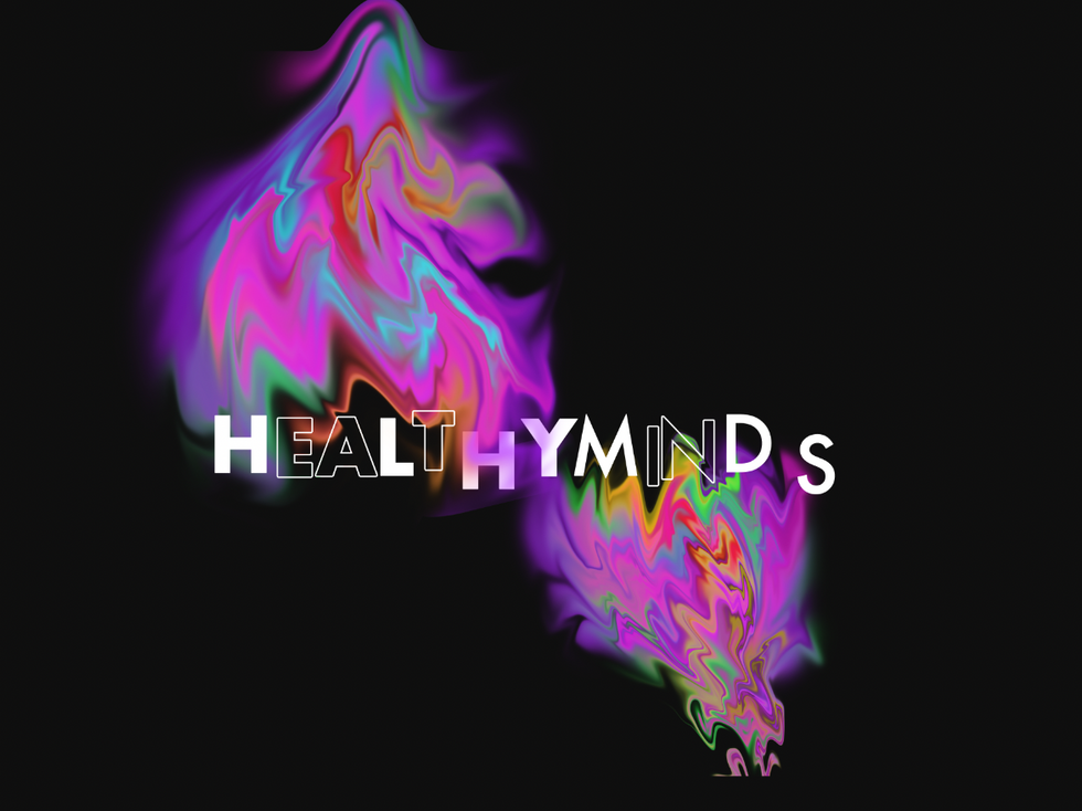
Approached by Aiden Horsley to create a logo and posters for a new fortnightly event that the Healthy Minds brand is working on.


As I work with Aiden a lot now, I find it easy to converse with him and make sure we're both happy with the final outcomes; I keep him updated with the design process as I go as he is also very creative and always has a specific vision. This makes me keep my options open and ensure I give him a wide variety of options to choose from. (as displayed above) Learning over the years that although I may not be a fan of my designs, at a point where I'd normally just delete it without any record of it, someone else might really like it as we don't always have the same tastes and aesthetic.

As a big fan of the 'A Bar Below' poster above, Aiden asked me to use that same style, but using a darker colour scheme after choosing the logo and text face that he liked. Below are screenshots from the process


Originally making the majority of the poster in illustrator. The client asked for some alterations that were easier for me to do in Photoshop. Therefore I had to save each asset separately as a png. (below) to import to Photoshop and assemble again


Process Time Lapse
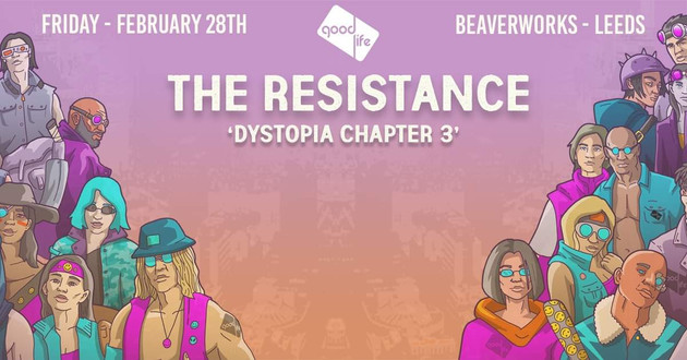
Good Life posters
Aiden Horsley has been in touch about simple re-touches for a poster for an event at Beaverworks that he is a part of; inputting DJ names and some other basic info. Leading on from this, he returned mentioning a poster for an upcoming event that he will need, made from scratch.


Given the template (above) by Aiden, I was asked to try and find a font that looks similar to the existing type-face. Instructed that it didn't have to be exact, I wanted to try and implement a similar drop shadow, texture and spacing whilst also drawing more attention away from the title and to the artists' names.

Originally thinking Bebas Neue, as a classic and typical font for companies to use, might fit the exisiting artwork. Adding a heavier drop shadow to create emphasis, I came to the conclusion that it didn't really fit the artwork as well as I intended. This led me to flick through a few more fonts quickly to ensure it looks similar.


Work like this, I believe can be very important as touch ups and smaller jobs can be a quick source of income that may be relied on when in industry if workflow and income is slow.
EKO Animation
Humanity T-shirt brief
Eko Launch poster
LAU T-shirt Competition
Struggling to finance my event, I was looking for various sources of income. After visiting Aderice Palmer-Jones (University President) to ask about the alumni fund and other bursaries available, she sent me an email enlightening me about the t-shirt competition that the university hold. As a customer of my clothing line, Gemini Branding, Ada personally recommended I apply as the t-shirts are printed and sold around the university. On top of this, if your design is chosen, the prize is £100. I decided to apply as not only a great potential way to get funding, but to also increase awareness of my brand and designs.
With my constant busy schedule for planning my event, I found it hard to make time to design something new and original for the competition. Instead, I applied using a design that I loved but never saw much time of day due to the production time of my last event 'After Dark'.


This is a design that I worked on collaboratively with an illustration student and close friend Emily Coulson. It was originally meant for my event during second year, but with a lack of organisation unfortunately they design wasn't produced in time for me to screen print them ready for the event date. Therefore, I thought this would be the perfect opportunity to release a relatively unseen design. [FURTHER INFORMATION -> ELEMENT T-SHIRT COLLECTION]
Not The Deep animation
Visiting the BAME exhibition at the Corn Exchange (explained under 'LAU Artfest 2020' beneath), I went by myself to see a friend's work as I unfortunately was too busy to submit myself. After mingling and socialising with new people (as I only knew about 2 people there) I found myself talking to and getting to know Simmy Kanda and Maryam Saira; two third year students at LAU. This opened up further possibilities for me, then going on to work on a collaborative project with Maryam, helping her with the branding for a collection entitled 'Not That Deep'.
Working on this project helped me gain a better understanding of different styles and larger appreciation for various aesthetics and preferences. Meeting Maryam after university, she immediately showed me a particular style of Gothic font, which is something I personally would never use when creating something personal to me. However, she had a clear idea of what she wanted and how she envisioned it, and looking at it professional, as the designer I'm here to fulfil the clients wants and demands.
Letter to my Oppressors Animation
Another animation for Maryam Saira and her Not That Deep branding.
Devon Chambers logo
Healthy Minds x Till? Presents Animation


Process Time Lapse
Creating an animation for Healthy Minds; a new event collaborating with Till Presents? I made a mockup animation without all textures, colours, backgrounds, images, etc. as I thought it would be a quick render to show the client and get my initial concept/idea across to gain their opinion on whether to carry on or not. Thinking this would save me time in the long-run, I was mistaken, as this stripped-back render took 30 hours. Although this render time is ridiculously long, with the current closure of uni and the global pandemic, I want to take this time to make my current work the best it can possible be; proud to put it in my portfolio and display it anywhere. Threfore this will become my main focus for now, until I can build or buy myself a computer that can render animations like this a lot quicker and has enough storage to run, compile and save everything I need on a SSD as opposed to a hard drive as I am currently.
Update: the client got back to me and let me know that this project has been put on hold anyway due to the pandemic so I won't be required to work on this for the foreseeable future.
Illustration Practice
With the COVID-19 pandemic looming large, being stuck at home I found myself losing motivation and inspiration with my work. Becoming aware of it, I wanted to get myself back into working again, doing something I enjoy and don't have to take too seriously. I decided to do some illustrations as it's something I don't find myself doing too often but really enjoy.


Taking inspiration from model Edie Rose, someone I follow on Instagram, the colours, lighting and composition of the photos really interested me; lots of contrasting edges, shadows and angles to work with.


Revolution - Job Opportunity


Inspiration for posters, accumulated by myself and the client in order to help set the direction of the project before starting so we can both be happy with the final outcome. Working with Aiden has become more and more enjoyable for more, as we've gotten to know each other better over time, we're able to bounce ideas off each other quickly and get to the end picture a lot quicker than with some other clients.


Final outcomes sent to the client to show to his boss at Revolution Call lane for potential employment to design posters for all of their events. Aiden told me that he was having a Skype meeting with his boss and wanted to show him potential ideas and a few mockups for event posters to flaunt my skills and promote me and try and get me the job. This gave me a short time frame but managed to create a lot of variations within the same day in order to give the client a wide range to give myself the best opportunity, as I'm sure he'll like at least one.


All these variations were made whilst in close conversation with Aiden for clarity on the direction that he wanted to take it, as sometimes when I create work for him I go down a tangent that he isn't a fan of so I find it easier to keep him in the loop whilst I'm making them; relying on quick replies to help us find the final outcome we're both happy with.

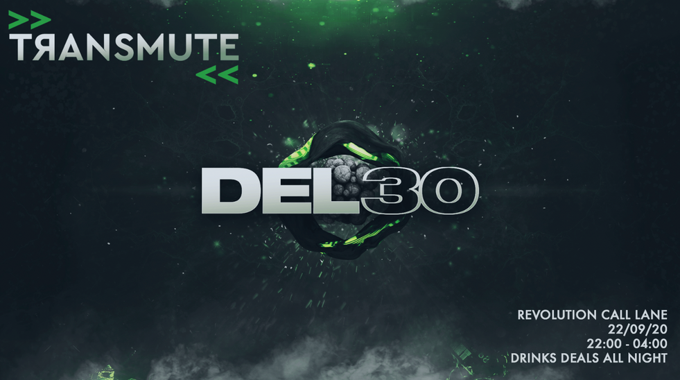
Colour corrections/variations to appeal to a different audience, ensure the client is happy with at least one colour-way, or can be used as a repeat poster for recurring events. Sending the colour variations to multiple people in advance I received varied responses; some people preferring the brightness of the purple; others admiring the dark, space-resembling orange and blue.


Connor Lloyd EP Artwork


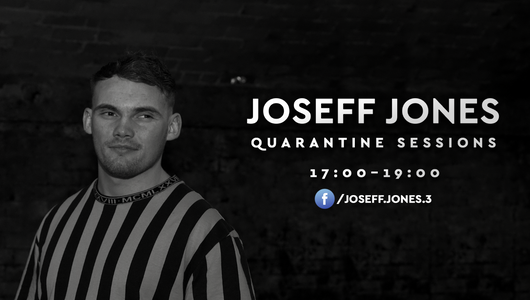
Joseff Jones Live Stream Designs


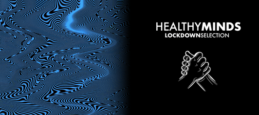
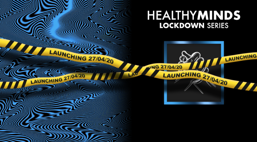
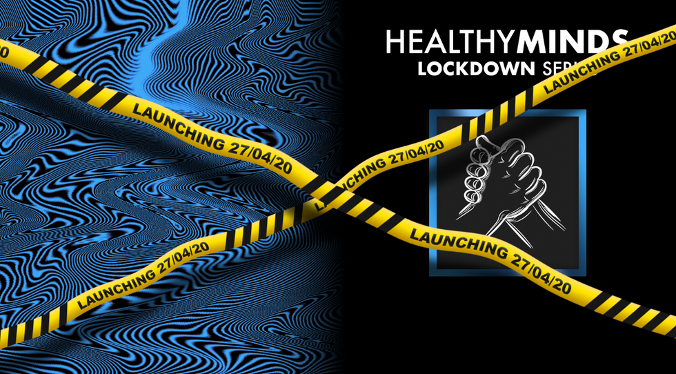
Healthy Minds Lockdown Series: Artist/DJ Promo
Aiden Horsley approaches me with another idea whilst I'm finishing up some work for the Transmute/Revolution job opportunity. His brand Healthy Minds is using their page to promote people's music and creativity during these hard times; he has asked me to work on a template to overlay on images for when they upload/promote people. This means it'd be repetitive work, changing people's name's and pictures each time.


Under the instruction of the client, he was looking for something 'trippy' in a poster format. I immediately wanted to direct it in a way that allowed me to be creative with it and maybe animate it to demonstrate my skillset well. My immediate thought was to create some line drawings, using contrasting colours and overlapping them and animating them. Creating quick replicas in illustrator, this is what I came up with.
Moving on from this concept, with Aiden preferring me to try other options, below are the steps I went through when knowing the base of the design was liked by myself and the client.


Aiden wanted a square that was slightly blended into the background as shown above, but neither of us could come up with a version that looked good and had the right aesthetic that we were after. After struggling a lot, I decided to take some time away from it and come back to it with a fresh mind as I believed I was trying to overwork it and therefore hit a creative brick wall.
Rethinking the process and the client, he is always a fan of darker, more subtle designs so I decided to try a dark grey as opposed to the white that we were fixating on, creating a think square around it and applying a reflected gradient to create a chrome-like effect. This was the perfect choice, receiving great feedback from Aiden. The next step was for him to decide: the name.


I wasn't ever a fan of the typewriter font that the client requested for the release date in the bottom right corner, so when he asked what I thought, I gave my honest opinion and gave him some options that I thought would work a lot better to not disturb the aesthetic of the poster and create confusion. Using a bold variation of Futura font, I thought it'd look best directly under the square as it creates an easily visible line for the audience to read down; also offering a version in the same corner that Aiden wanted it originally just in case he didn't agree with me.


The final choice, inevitably he agreed with me, deciding down the middle worked the best.


After Aiden said he was really happy with the design, I sent it over to him for use on social media. However, once he came back to me for the first artist post, I had the idea to make the banner look smoother and more natural; recreating it and animating it in after effects.
Below is the first animation I made for Healthy Minds Lockdown Series, using the poster with an animated banner (collated and exported through premiere pro).


I have been creating roughly 1 animation a day since the beginning of this series, keeping me working throughout quarantine
2,000 Like Animation | Healthy Minds
BabyStep Animation possibility
Music for Mental Health
Another series for Healthy Minds approaching soon, which I've been asked to produce the artwork for. Similar to Lockdown Series, but aimed more towards raising awareness of mental health; this will require some relatively straight-forward artwork, repeating the base and changing info, pictures and audio files.


PyroWork Logo
Working from home, my brother has seen a lot of the work I've been producing and showed a lot of interest. As he works with Starling Bank, helping with software development alongside other things, he has been learning a lot of coding and made friends with an array of people with their own businesses and ideas. PyroWork is a company in-the-making by one of my brother's friend and he has come to me asking me to design a logo for the company, as he is unhappy with what he currently has and wants a fresh outlook.

As this opportunity has arisen within the week of deadline, I won't be attempting to force and cram work in right now, but will be a project I look forward to working on after submission.
Golden Bengal Website
Another project that my brother has helped me source; this one a lot more family-orientated. My dad own's an Indian restaurant and has asked my brother to help re-code the website and make it more current and up-to-date. With seeing some of my work, as explained before, my brother has come to me and asked if I can design all the assets for the website to make it look aesthetically pleasing, and he will then do the coding aspect of it to make sure it's functioning properly around my designs.

Again, as a late arrival, this will be a project I work on very shortly after hand-in. This also gave me an idea to take Gemini Branding further - and work towards making it a company that also helps brand businesses. With my brother adept with coding and myself creating designs; we could combine our talents to create some impressive outcomes and this could branch my brand out to becoming a much larger project that could become my main source of financial income.
OTHER
Business Cards
YouTube
Tim Walker exhibition
Duke Studios visit
Run/created by James and Laura who couldn’t find anywhere cheap enough to work in a city so did it themselves
Originally at monroe house
2015 moved to sheaf st
Duke Makes - signage in store, made to order
Directory through iPad - keeps workers up to date when an appointment will arrive, etc.
20% discount as staff
Community socials, great for networking and immersing yourself into other people’s work to see if there’s anything of interest
3 sections:
Co-working desks - £115 a month - no set contract Mon-Fri 9am-5pm (office hours)
Permanent desks - £250 a month - 6 month contract 8am-11pm
Studio/pod - £440/month - 12 month contract 24 hour access
Designed to be a neighbourhood feel, inviting collaboration
Curated application process - 6 month free after graduation - every six months an alumni space is given - LAU website, insta, fb - application form - interview (next is end of June)
Rabbit hole design team
and rising ??? - larger studios upstairs
Hireable 2 meeting rooms (‘not bored rooms’) creating a new and exciting space to use for meetings and other impromptu seminars, talks, etc. that take you away from the standard, typical, boring office rooms.
After work Wednesday - life drawing, AV club, Duke Makes events
Follow on insta and Facebook
Key part of making channel 4 come to Leeds
Hungry sandwich club
Apply with business idea, how you’d use the studio, then shortlisted and interviewed
customer base, competition, what you’re selling, how you’re going to make money and plan for 6 months
Mentoring from alumni, to professionals that have been in industry for years
License to sign, £50 deposit,
East street art
Assembly house
LAU ArtFest 2020
Exhibition created by university president, Aderice Palmer-Jones, for Black, Asian and minority ethnic students. I was asked to submit artwork, however it came at a bad time as I was focusing my concentration on my event as I was unable to provide much time on other work. I visited the show on opening night to show my support to a couple of people I knew that had submitted. This proved to be a great night for socialising and networking, meeting various third years on a range of courses that I wouldn't have met otherwise, including Maryam who I worked for on the 'Not That Deep' brand animation in the 'Brief' section above.


London Symposium
The afternoon was split into sections, first of which was 'Advertising and Branding'. Andy Howell has been working at The Clearing as a creative director for over 10 years. Managing brand consultancy they are composed of a team of writers, designers and consultants, working with companies such as McLaren and Wimbledon.
'Fundamental of problem solving is the main similarity between design and illustration'.
Andy made it clear that Instagram is probably the main channel that they are interested in when finding designers and illustrators as it presents the most recent work, not only demonstrating your style of work but also how active you are as a designer.
The Hanbury Hall symposium came at a perfect time, allowing me to travel down to London to visit the Eko Magazine Launch Party that I had helped working on in the last module. Maintaining contacts is a skill I believe will prove to be incredibly helpful after university. Slowly gaining more confidence when visiting exhibitions and other events, I aim to use these situations to full extent in regards to networking.
Advertising and Branding
Andy Howell - The Clearing
Creative director - 10 years
Brand consultancy
Writers, designers, consultants
McLaren, Wimbledon, etc.
‘Fundamental of problem solving is the main similarity between design and illustration ‘
Instagram is probably the main channel
Behance and dribbble too
Maintaining direct contact with the illustrator is important, regardless of agents
Finances, admin and legal side are dull yet very important which is something you need to keep on top of. Get a great client or agency name under your belt - immediately gives you credibility, raises your profile, etc. If you have to work for free, the pay off may be greater
To keep yourself noticed - Low level of communication - keeping a constant awareness, rather than being targeted communication, keep subtle/general noise, so you’re always there and ready rather than big communication once in a while. No such thing as a bad brief, avoid bringing in freelancers where possible. Hire interns but have about a team of full time of around 7/8 graphic designers so they’re less likely to bring in freelance as it tends to stray from their brand name/reputation/style.
Matt Nankivell
Oglivy - Art/Creative director
Design business too - Frankly? Perth
Client List: Dove, Unilever, Hellman's, Comfort, Formula 1, Samsung, BA
Come across designers and illustrators through word of mouth, Instagram, behance
Team of art buyers/producers who source people to match what they’re looking for
Experience from bigger companies - working with bigger clients, bigger budgets and learning how to handle professional clients alongside a team, learning from mentors and more senior members of staff - main reason he came to London, getting experience at that level
Smaller company - hands on experience, build better, more personal relationships, learning directly from clients and gain appreciation for account managers
Work in the industry of rejection
Face to face connections as early as possible is vital as emails are flooded constantly
Junior designer roles are important to absorb as much info, skills and experience as you can
Email, send physical things to agencies, something that reminds them of you that gives them more motivation to get back to you over anyone else
‘I know you’re busy, I appreciate your time, but if you have time...’
respectful of time and being polite and a good person - too many assholes in the world, stand out
Big advantage to starting in a smaller market - hands on and you have to work a bit harder to push and get your work out there
Moving to London you tend to have a bigger market behind you but from previous experience you’re used to having a good work ethic so you stand on your own two feet and less likely to become a liability
Easy to bring in freelance for when work/briefs get too much as it’s easy to hire someone for one specific brief but generally speaking they are a team of around 200 whereby a lot of them are graphic designers who they are used to
If freelancers are used there are occasions where they are used multiple times and slowly become part of the team
THE CLEARING - INTERNSHIPS
London Bridge location SE1
OGLIVY
YUNOJUNO
Agency hire -
AGENCIES
Sam Summerskill
B&A reps - used to work at DebutArt
Greatbarry
BA is first to represent illustrators and animators
Motion/Animation -
ILoveDust- Sam and Mark
Bright Agency - Vicky
ANIMATION - 20% commission
Makes conversing between clients easier, as they have good relations to make sure that they’re not taking the piss with payment, amount and taking advantage
5 in house lawyers - deal with IP
Contract law
Volt49
Have to be a good person, ideas, able to think quickly on your feet, unique art work and outlook, good communication skills
There’s so much artwork out there right now that you have to have your own style
Focus has to be making work and getting better at your own practice, as if you’re not you fall back because you’re not pushing yourself,
Motion graphics is more of a niche - especially on these specific agencies mainly because it’s a relatively new and upcoming thing.
Itsnicethat jobs board
Phone or face to face is the better way to ask for jobs/internships etc. makes you more memorable
Arthur Carey
Polytechnic graphics studio -
Branding, prints, etc
YCN Shoreditch - rebrand work Green Man Festival; typeface
Casper Franklin
Design/animation studio - Shotopop Studio
Savoy drinks menu; special packaging for Johnnie Walker, etc. led onto more and more drinks related design
Solving a problem is a better way to work than resolving a brief because you can take it in your own way and there’s no limitations or restrictions
Collaborative studio, when you hit a wall you can give your project to someone else for however long to see if they can reimagine the path you’re taking it down, allows for fresh eyes and a new vision, developing ideas and increasing workflow
Remember having kill tees and other statements in the contract that allow yourself to be paid for work that you’ve done, even if the client don’t like your final outcome
Do what you want to do and be passionate. Excitement about what you want to do will get you where you want to be in the end. Being polite, taking the high road and showing charisma in everything you do.
Graphic communication @ Bath Spa -
Tess Redburn
Taught you are either an illustrator or graphic designer. Internships learning about the industry and how your practice can be applied in various ways, each step will lead to the next - slowly progressing up the ladder
Be good at admin, save invoices and stay on top of contracts, etc
Continue to collaborate with other students and friends, keep the creative flow going so it doesn’t die out before you find your job working on live projects at different studios, etc
Helps influence with more interviews etc, as it shows good intentions and passion for your practice, increases chance of employability
Augment what you’re capable of doing and expand your practice, incorporate all aspects of design into your redefines practice. Include other mediums, play around, vary your skill set
Drawing on CV to make stand out?
Cube Design
Grain Media
Instagram & Cinema4D queries and problem-shooting
Conversed with Amin Fouari; as a graphic design student that graduated from LAU last year, his current situation will be directly relatable to me and he has proved to help me on multiple occasions in regards to my work, issues and questions i had. My first dilemma was about my instagram. After the symposium in London it became apparent how it is a very important tool when potential employers find you. Originally ‘ai.noodles’ I decided to change it to a more professional name of ‘air.graphic’, keeping my work and personal life separate so it’s easier to navigate for clients. This can properly refine and attract a specific audience; receiving advice that a lot of people try and mix business & personal and it doesn’t work as it becomes hard to focus. Working with a separate instagram also allows easier contact between myself and other designers.
Render farms - split render time between different computers/laptops. Connect them to work on the same project, minimising the time spent rendering
London Artists Meet group
Potion Picture London


Comments